How to make infographics with impact
How to make infographics with impact
Infographics are a fantastic tool for any business looking to engage people through quality content and visual insight. As they become ever more popular, here's our advice on how to make infographics. (Here are three reasons to use infographics.)
Get the right data visualisation idea
Well-designed and well-executed infographics will raise your profile, show you as an expert and can even go viral, meaning you get a great return on your investment. But this potential can only be reached if you create something truly useful and genuinely engaging.
Typically, infographics work well where the information to be communicated is statistical and number based or where complex relationships are to be shown. Infographics are generally about data visualisation, but that doesn't mean you can’t communicate something else.
Perhaps you want a visual way of showing the structure of your business or simply want to explain a subject in one clear image. Whatever the idea, make your infographic useful, relevant and worth sharing.

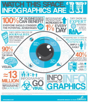
The 'Infographic of Infographics' shows all you need to know about infographics in one engaging image. Source and full-size version: www.zabisco.com
Get the right infographic brief
Creating a brief is a key step on the journey to data visualisation and infographic success. Even if you plan to create the infographic yourself, it's well worth putting together a document to clarify your ideas and refine your messaging.
This means understanding what the intent of your infographic will be and what effect you hope it to have on your business. It may be for branding – infographics are great at showing your brand and helping people to understand what you’re all about. Or it could be for a more specific purpose, such as increasing traffic to your website.
More specifically, you need to be clear on the message you want to convey, both in terms of the individual facts and figures and the overall picture you want to paint.
Your brief for creating an infographic should be as comprehensive as possible. Once it is written, consider whether it could be handed to a designer who could then create the infographic without asking you any questions.
If they would be able to do this, then you have written a good brief – if not, then think about what you need to add.
Get creative with data visualisation
Infographics are an extremely creative mode of communication – that’s what makes them so engaging. The majority of your content should be visual. You can use graphs, illustrations and metaphorical representations for data visualisation and to get your ideas across.
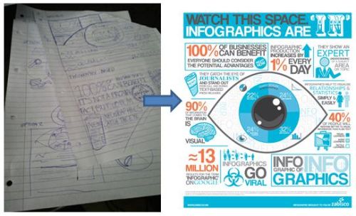
Sketch out your ideas to flesh out how you want your infographic to look. You can’t do too much experimenting with pen and paper before you start; it’s not productive to be trying things on screen without mapping them out on paper to begin with.

Sketch out ideas and give yourself different options to choose from. Source: www.zabisco.com
Your brand personality can really shine here, too. The style you choose when you make an infographic will say a lot about your business.
You may want to use a linear layout with straight lines and simple illustrations to portray a formal image. Or a fluid, colourful layout can show your company as a little more fun.

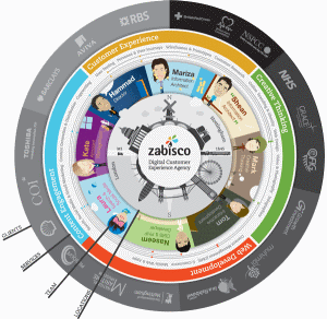
Make an infographic - it's a great way to showcase your business. Source and full-size version: www.zabisco.com
Consider any brand logos or images you are using. Do you have them in the format you need? Are there alternative versions for a light or dark background?
Most designers will want images to be supplied in TIF or PNG format with a transparent background. This means they can be dropped onto any colour without having to be cut out manually.
Execute your infographic
Ok, now it's time to sit down and actually make an infographic. Here are the key elements to consider:
Layout
The layout of your infographic and its orientation will depend very much on what you are trying to achieve and how your infographic will be used.
If the infographic is for use online only, a portrait orientation works best and looks great within blog posts or as part of a web page.
Alternatively, a landscape format may be better, as with this infographic from the Blackberry website about how businesses can grow using mobile technology:

This takes a whole web page and uses a magnifying tool so you can zoom into it. This meant the designer was able to use a smaller point font and fit in more information.
Programs to use
There’s no right or wrong approach when it comes to what program you use to make an infographic. Typically, infographics which use a lot of illustration will be created with Adobe Illustrator, while photo-based graphics would benefit from Adobe Photoshop.
However, both of these are professional design tools, so if you're not a designer you may find it hard to use.
Although it's hard to make a really polished, professional infographic without some design skills, there are lots of simpler tools. For instance:
- Hohli is an online chart building system. You can also use tools in Microsoft Excel to create charts and graphs.
- IBM's Many Eyes lets you view data visualiations that other people have created, and create your own.
- Creately is a drag-and-drop tool that's very versatile and can help you create all sorts of data visualisations.
- Visual.ly is a relative newcomer, pitching itself as a place to see other people's data visualisations and share your own - and promising infographic creation tools soon.
Delivery
When delivering your infographic you need to think carefully about what format best suits your purpose. For example, the Blackberry infographic shown above was created in a format ready for a website because it had to include links and clickable features.
If you plan to use your infographic in print, you'll need a high-resolution version. If it's just for other websites, you will probably need to create a smaller image - probably in JPG format.
This guest blog post was written by user experience agency Zabisco. For more infographic ideas, check out the Zabisco blog or contact the company about its infographic services.


Comments
Add a comment