How to master responsive email design
How to master responsive email design
When you were growing up, did you ever have breakfast cereals with a toy inside? Not knowing what you'd find nestled within your cornflakes gave you a good reason to get on and eat the entire box in a single sitting.
The element of surprise was exciting back then. But it doesn't translate quite so well to the world of email marketing.
Do your emails look their best?
When you send out marketing emails, they'll be opened by people using an array of email clients. Can you be sure that your emails will look good in Outlook, in Google Mail, on an iPhone and on a tablet computer?
This isn't something you want to leave to chance. Every email client has its own quirks, so this blog post takes a look at how to make sure your emails look good in as many of them as possible.
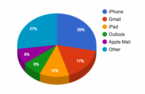
Although there are a lot of email clients out there, the top five make up around 73% of the market. If you cater for these, you'll be well on your way to running successful email campaigns:
Why does responsive email matter?
You can see from the chart above that people tend to open emails on mobile devices more than anything else.
To ensure your emails look right on mobile devices, you need to make your emails responsive.
You might have heard of responsive web design before. With emails, it's the same: a responsive email changes shape and size so that it displays properly on the screen of any device.
Essentially, it adapts itself to fit anything from big desktop monitors to tiny smart phone screens.
The HTML code from which responsive emails are built can be complicated. The basics are straightforward, but the code required to cater for different devices can become confusing.
For this reason, we don't recommend attempting to code HTML emails yourself, unless you're confident and experienced at working with HTML.
However, taking some time to understand the principles underpinning email design will make it easier to work with designers and developers.
What to ask your email developer
Here are some things to ask a developer who's working on your marketing emails:
- Have we checked what devices our recipients use?
The graph shown above is taken from Litmus. It's a good overall view of email client use, but your own customers might have a different profile. For instance, if your email subscribers tend to be people in large companies, you might find more of them use Microsoft Outlook. Your existing email marketing tool may be able to show what clients and devices your recipients use. - How flexible is the width of the email?
Catering for different screen widths is fundamental to successful responsive email design. Designing your emails with a few key screen sizes in mind is key. Ask your developer to show you how the email changes as it appears on screens of different sizes. - Have you put the key styles in line?
Bear with us — we're going to get a little technical. The appearance of visual elements is governed by cascading style sheets (CSS). These define, for instance, what font, size and colour should be used to display text. When building a website, the CSS is usually separated from a page's HTML code. But when creating an email, your developer should include the CSS with each individual element. This is called 'in line CSS'. - What proportion of clients have we tested it with?
It's very hard to create an email that looks perfect on 100% of email clients and devices. (You can do it, but it would cost a fortune.) There are just too many permutations to cater for. The best way to spend your budget is to concentrate on the email clients your recipients are using. Cover 80% of these and you're doing well.
Remember: when you're building marketing emails, you can avoid duplicating your efforts by creating a few email templates to edit and reuse easily for regular campaigns.
And finally, once you create those templates, test them on different platforms and devices. Make sure your customers see what you want them to see.
Copyright © 2015 Amir Jirbandey, expert contributor to the Marketing Donut.


Comments
thank you for this. helps understand mailing.
Add a comment