Google, please stop messing with things that work fine
Google, please stop messing with things that work fine
I'm a long-time user of Google Mail. By and large, I think it's brilliant.
The enormous amount of storage space means my email archive contains thousands of messages going back over half a decade. I can log in from anywhere and find exactly what I need in moments.
Making Gmail worse
But last October the search giant started testing a new interface for writing messages. Now it's decided to roll it out to all users. And, unfortunately, it's a backward step.
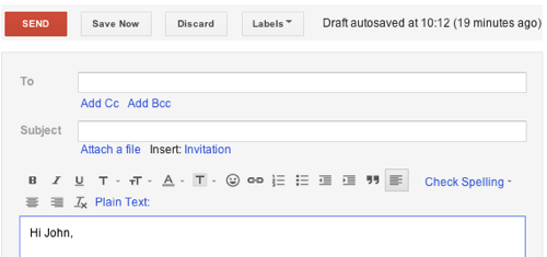
The old interface might look rather traditional, but it does the job well:

The line of icons across the top ensures you're never more than one click away from inserting bullets or links, indenting text, changing formatting or running the spell check.
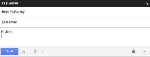
Contrast that with this new, cleaner interface. When you start writing an email, this pops up over your inbox:

With icons stripped from the interface, it takes more clicks to find functions that were previously obvious:
- To add bullets or change text formatting, you must click the underlined A to show formatting options. A second click picks the option you want. That's twice the clicks it took before.
- It works differently when you want to add a link or emoticon. There's no extra click, but you have to run the mouse over the + symbol to reveal the option you need.
- The process for finding the spellcheck is different again. First, you have to click the non-descriptive down arrow at the bottom right. Then choose Check spelling from the list. Once again, what previously took one click now requires two.
Google says the new interface is faster and more focused. I contend that having to think harder about how to insert a bulleted list or embolden text is almost certainly going to break your focus more effectively than the old icon toolbar did,
Besides, the new interface keeps your inbox visible behind it, so you can see new emails as they arrive. That won't be distracting in the slightest, will it?
Looking for a deal?See the latest business tech bargains we've found online. Or buy IT equipment now from these trusted suppliers: |
Your email matters
The way email works is important because we spend so much time using it (more than a quarter of the average day, according to some research).
When companies alter services like these that we're comfortable with and rely on, it can make us less efficient, change our working practices and make us feel uneasy.
That's the way I'm feeling at the moment. And that's why I'm irritated by Google's unneccessary tinkering and arbitrary changes. Maybe it's time I switched to Microsoft Outlook instead.


Comments
I stopped using it long back..
Couldn't agree more. Whatever happened to 'if it ain't broke...'? All for the sake, I suspect, of advertising something as 'new and improved'.
Add a comment