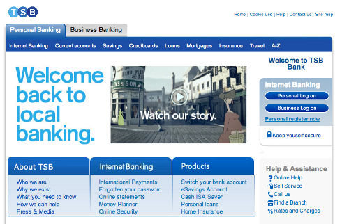
TSB shows how not to launch a website
TSB shows how not to launch a website

Old skool: the new TSB website
Ta-da! When you've finished putting the finishing touches to your new website, you want the world to know about it.
That often means emailing your customers, shouting about it on Twitter, posting to Facebook and maybe even paying for some ads on Google.
The tale of the new TSB
However, if you're about to set a new site free, you might want to take note of what happened to the relaunched TSB bank earlier this week.
The new bank is being spun off from Lloyds. But when it launched on Monday, its new website promptly hit problems.
Many customers reported they couldn't access the site at all. As a result, the news story that generated most attention was about the website problems, rather than about the bank's launch.
A design from 1999 ... or earlier?
But perhaps worse than launch-day hiccups is the fact that the new bank's website has a decidedly old feel to it. I mean, look at it. Could it be any more 1999?
It's not that an old design is a bad thing in itself, if it works. But surely an organisation billing itself as 'Britain's newest bank' should at least have a vaguely fresh website.
As you might expect, it's come in for a slating on Twitter:
- Well, I think it's lovely that as TSB de-merges from Lloyds after 18 years, they've finally implemented the web site they designed in 1995.
- @brucel - Points at new TSB site: http://t.co/iAOmiCXH3w Starts laughing. Then starts crying. (via @KatherineCory)
- @anna_debenham - So Lloyds TSB are splitting into two separate banks again? Looks like Lloyds got the good designers in the divorce... http://t.co/jrd5CJCvkh
- @BenNunney
We can all learn from this
Getting a new website off the ground is not an easy thing to do
It's almost certainly much harder when you're doing it for a brand that has a history dating back to 1810 and is part of a heavily-regulated industry.
But in this day and age, when a website is such a central part of your customer experience, it's absolutely inexcusable to pass off an outdated design as your main customer-facing website.
In a sector where trust is everything, starting out with a website that looks like it hasn't changed in ten years is not a great way to win people's confidence.


Comments
Yes I think the guys at TSB would agree that the new TSB website is a bit of a shocker and we can all learn a lesson or two from it.
But perhaps the amazing thing is that they managed to have a live website at all.
This was no ordinary re-launch. It was Brussels ordering Lloyds Bank to set up a competitor to itself within a short timescale. Co-op Bank was going to buy the TSB operation but suddenly pulled out with less than 5 months to go, leaving the small TSB team to create a whole new banking operation in time for the September launch deadline, instead of simply adding some branches to the existing Co-op Bank setup.
So my guess is that the TSB team were focusing on the crucial back-office end of things, ie the technology that underpins banking, while a Lloyds team knocked up a quick website for the new bank ... chuckling to themselves while they did such a poor job for their competitor-to-be.
I think you'll find that designing a proper website is on the post-launch to-do list, along with 1,001 other things. We outsiders may point and laugh, but the website is probably the least of TSB's problems.
Add a comment