Blog posts tagged usability
Website error pages: don't 404get them!
In an ideal world, every page on a website would work and nobody would ever see a website error page. But we don't live in an ideal world and website error pages are very much a part of the online experience – so why not make the most of them?
Website error pages are shown when something goes wrong with your website. Typically, this will be a 'page not found' - a '404 error' - where a link has moved, although it could be that the user has simply mistyped the address. Different types of errors have different codes - common ones include the 403 'forbidden' error or the 500 'server error'.
Errors are regrettable, but certainly not unsalvageable. A well written error page can actually benefit your brand and help instil trust, proving that you take ownership of mistakes and do your best to rectify them.
You can also be creative in the design, using your website error pages as places to show off your fun side or promote your artistic talents.
And it's not only your users who will benefit from a custom error page. Search engines will reach error pages as they explore your site. Again, providing they are well written and well-designed, they can be portals to new content rather than dead ends.
Here are our top tips for creating the ideal error page:
1. Be honest
Honesty is very much the best policy on an error page. Accept that something has gone wrong and explain why it has. That way, users will be more accepting that sometimes things do go wrong and far less likely to leave your site.
This example uses honesty and apology to help lost users. The use of 'I' shows the brand as one which takes responsibility for mistakes:
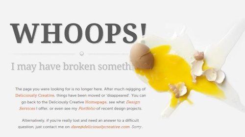
Smashed eggs from Deliciously Creative.
2. Be helpful
Allowing users to become stranded on your error page will ruin their experience and probably cause them to leave. Give them somewhere to go by offering useful or popular links.
Here, users are given possible solutions to the problem, along with useful links which mean the page is not a dead end:
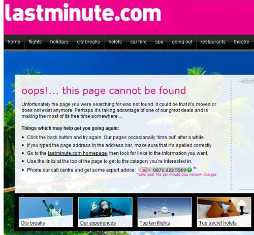
From Lastminute.com.
3. Be yourself
Showing your personality is a good thing. Whether your website represents a corporate brand or a one-person shop, giving your error page an (appropriate) feel will welcome the user and help them feel comfortable staying on your site, despite the error.
This page follows HootSuite's owl-based branding and adds a bit of humour to the situation:
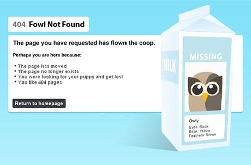
From HootSuite.
4. Be creative
Don’t be afraid to let your creative juices flow! Just because your error page won’t appear often doesn’t mean it shouldn’t look great. Plus, error pages don’t need a lot of content, so you really can go bold with the visuals. Here are some of our favourite creative error pages:
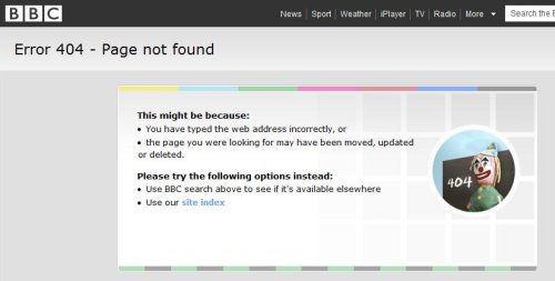
The BBC uses the old-skool testcard to great effect.
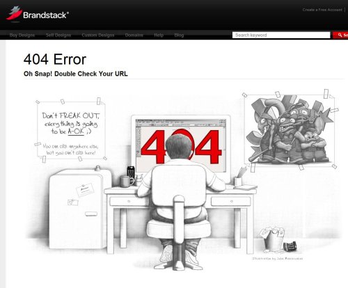
Brandstack have a whimsical pencil drawing.
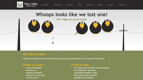
Frye / Wiles have gone with some birds on a wire.
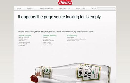
You have to love this great use of the iconic Heinz tomato ketchup bottle.
Laura Hampton works for Zabisco. Read the Zabisco blog.
What I learnt about the future of web design
Last week I headed on down to the Future of Web Design conference. Held in an old brewery in the City of London, this annual event brings together web designers and developers from all over the world.
I really enjoyed the conference and it was a great chance to get away from my day-to-day tasks for a bit. Although a lot of what I heard was quite detailed information aimed at professional web developers and designers, I took away a few bits of knowledge that I think nearly any business with an online presence can benefit from. Here they are:
- If you're considering building a mobile app for your business, don't forget about making your website friendly for mobile phones too. In particular, Josh Clark argued that people see mobile apps as tools for getting particular tasks done, whereas the mobile web is all about finding information.
- In fact, a lot of the conference covered mobile-related internet stuff. There were some impressive statistics involving the amount of money people spend when online with their smart phones, and the rate at which accessing the internet via mobile devices is growing. In short: if you're not thinking about mobile devices when you build your website, you're neglecting an ever-increasing group of users.
- Ian Hamilton is a senior interaction designer from the BBC. He gave a talk on accessibility, making me realise how far most websites still have to go in order to be usable by people who have visual, auditory, motor or cognitive disabilities. He suggested including people with disabilities in any usability testing that you run, providing transcripts of all videos on your website, and ensuring all linked text is meaningful ('more information' does not cut it).
- Dan James founded silverorange, a small web agency based in Canada. He spoke about running an open business. In his company, everyone - from the MD down to junior designers - earns the same salary. He says that often in business we talk about a lot of things, but we don't talk about money. He says we should try it. These sketch notes reveal more.
- To design great user experiences, we should try and stay naive. At least, that's one of the things I took from Aral Balkan's talk. In an entertaining 50 minutes, he explained how he tries to not think too hard when he uses things for the first time. Because if something's been designed well, you shouldn't need to stop and work out how to use it. You should just know. Watch a similar talk here.
What do you think the future of web design holds? What new innovations are you planning for your website? Leave a comment and let us know.
Olympic errors: why you should take testing seriously

Launching a new website can be stressful. Just ask the organisers of the London Olympics, who opened their ticket website last week. After last Monday's big switch on, it didn't take long for people to twig that the site couldn't handle debit and credit cards due to expire before August. Whoops.
Interestingly, reports say that 'the website and ticketing guide clearly state that Visa cards must expire no earlier than August 2011'. In other words, the expiry date restrictions were known about when the site launched, but people weren't reading the explanation before putting in their ticket applications.
It's a common problem: people don't bother reading instructions, then get frustrated when things don't work as they expect. In short: if you have to explain your website, it's too complicated.
Always test thoroughly
Before you launch a new website - or any IT system - it's really important you test it thoroughly. You need to catch all the bugs you can and ensure everything is secure.
But that's not enough. Your site must be easy to use too. Can people find what they're looking for? Is your order process straightforward?
It might be harder to answer these questions definitively (not everyone's perception of 'easy to use' is the same), but it's vital you do your best.
If you're working with a software developer or web design company, they'll be able to help you with all kinds of testing. And there's plenty of information about usability testing on the Marketing Donut, our sister site.
But whatever you do, put time and consideration into how you test any new IT system . It could make the difference between success and failure. Or - as the Olympics organisers have illustrated so well - it could help you avoid any unnecessary bad publicity.
(Image of a ticket booth from Flickr user Sister72 under a Creative Commons Attribution licence.)
Why website usability matters
In the world of web design, usability and user centred design are buzz phrases of the moment. But what do they really mean for your business? And don't you have to have a big web design budget to worry about stuff like that?
What is usability?
Usability on the web is about ensuring everything on your website is as easy to use, read and find as possible.
At the most basic level, that means putting proper calls to action (things you want people to do) on your website, highlighting key areas and making sure everything works properly.
On a more advanced level, usability is achieved by structuring and building your website according to the needs of its users and the behaviours they display during testing and research.

The British Heart Foundation’s website structure is based on the feedback of focus groups and research through user testing. (The BHF is a client of Zabisco.)
Why does usability matter?
In today’s fast-paced world, your users have less time than ever to spend on your website. Why would anyone wait ten seconds for it to load when thousands of alternatives are a click away? Why would they spend time digging for information when other sites make it easier to find?
Users have a low tolerance of poor usability. And why shouldn't they? It's annoying when things are hard to use, and websites are no exception.
It’s vital your website works properly and loads quickly. Your web developers should be able to advise you on the best ways to achieve what you want from your website. Your choice of web hosting service can affect the load speed too.
But it’s not just about load speeds and functionality. Your website’s content and layout are also key elements of the user experience. By understanding the needs and motivations of people who visit your site, you can tailor your content to fit them.
Make your website more usable
At Zabisco, we create top class user experiences. We use customer research, information architecture, user centred design and content and web development to meet the needs of your end user.
But if you don’t have the budget to invest in user experience services from an agency, here’s how to improve your own website - quickly, easily and cheaply:
- Understand your end user. Your end users / customers / clients (or whatever you call them) are the most important people for your business. Understanding them is the first step to improved usability. It can be as simple as asking them. Pick up the phone – or even better, meet them in person.
- Simplify your navigation. Your navigation should direct users to the areas of your site they will find valuable, in ways they can understand. Simplify your labelling and ensure it uses language your end users are familiar with.
- Provide clear calls to action. A call to action is any button or hyperlink that asks your user to do something. Create calls to action which tell your users what you want them to do and help them achieve their goals on your site.
- Think about your layout. Show your users what they need to see – it’s as simple as that! A clear layout helps people navigate your site. It can also reflect your business branding and structure in a really positive way.
- Build your website properly. A top class website build will mean everything on your site works efficiently and intuitively. Think about search engine optimisation when building your website too, to help search engines recognise the purpose of your site and send you traffic that will benefit from your services and content.
Usability is more than a buzz word. Done properly, it will provide real benefit to your users and your business.
Laura Hampton works for Zabisco. Read the Zabisco blog.


