Blog posts tagged website
Is personalisation the way to more online sales?
 How does your company website stack up against bigger competitors? New research suggests that smaller companies can sharpen their competitive edge by creating websites that are mobile-optimised and personalised to meet the preferences of individual customers.
An online study of over 2,000 British adults found that small businesses rule when it comes to personal service. A whopping 71% of people said smaller companies deliver a more personalised offline service than bigger ones.
However, 59% of people felt that big businesses generally have better websites. Given that such companies typically have generous budgets to build customised sites, that's perhaps not a great surprise. (They don't all go to plan, of course - just look at Marks & Spencer.)
The research was commissioned by web hosting firm 123-reg and conducted online by YouGov.
And it suggests that small companies could clean up, if only they can find some way to deliver that same personal service online. After all, they're already beating big competitors in other contexts.
The problem with online personalisation
The problem is that it's not easy to deliver personal service via a website. On the internet, personalised content risks coming across as clumsy or misguided.
Just take retargeting banners, beloved of many an internet marketer. These are used to encourage you to buy a product that you've shown interest in.
After you've viewed a product on a website, you often see repeated adverts for the same thing as you browse different websites. That's retargeting in action.
Retargeting banners do work in some circumstances, but they can also engineer irritation and mistrust in customers, who get tired of seeing the same adverts over and over and over again. Worse, badly-implemented campaigns can see you targeting customers who've already bought your product.
But let's not get hung up on retargeting. The point is that it's easy to do personalisation badly. To do it well requires you to tread a fine line between showing customers that you know them, without becoming repetitive or overbearing.
How to do personalisation right
So, when you want to incorporate personalised, targeted elements to your website or mobile app, it's a good idea to proceed with caution.
Try to find some way to measure the impact of any changes. You could perform an A/B test, or at least try to monitor any change in conversion rates.
With that in mind, consider starting with some basic personalisation, such as:
- Greeting customers by name if they're signed in, and tailoring this greeting depending on the time of day. For instance, say 'good evening' if they're browsing after 6pm.
- Detecting a visitor's location and then using this to show them personalised content. For instance, you could show your nearest branch, or offer people in a certain town an extra discount.
- Altering your main call to action depending on the time of day. For example, if it's late afternoon then a restaurant's website could offer the option to 'book a last-minute dinner reservation'.
- Showing personalised recommendations based on what each individual visitor has previously purchased. (You'll probably have seen similar functions on big online shopping sites, like Amazon.)
In any case, it's definitely worth experimenting. As part of its research, 123-reg joined forces with Patrick Fagan, a behavioural scientist.
"The experiment shows that SMEs could almost halve lost sales opportunities and double their propensity to return to a site by using information about the visit to show specific content," he explained.
"It also highlighted that personalisation of a site significantly affected people's trust and empathy with the business which, in turn, directly translated into purchase and behavioural intent."
Or, in other words: appropriate personalisation really does help you sell more stuff.
Tools to help with online personalisation
If you want to incorporate personalised, targeted elements into your website or app, there are a number of ways to proceed.
The options available will likely depend on how your website is built. So, if you're planning a new site, it's a good idea to consider personalisation features before you get started. You might be able to:
- Use an ecommerce package or website building service that offers personalisation features. 123-reg has its own website builder, and other web hosting companies have competing packages.
- Use a plugin to add targeting functions to your website. For instance, if your website is based on WordPress, there are many plugins that allow personalisation based on user location, preferences and more.
- Get your website developer to build personalisation options into your website. If you've designed and built your website from scratch, this might be the only viable option - although it could also be costly.
Ultimately, your website is likely to be a key sales or marketing channel for your business. (And if it isn't already, it certainly has the potential to be so in future.)
With personalisation and targeting steadily becoming more common, now is a good time to consider whether personalised content could make it easier to compete with larger rivals.
Five things to do when your website goes down
 Has your website ever crashed? When it happens (and it happens to every website, at some point), it's a crisis because you can't do any online business. So, here's what to do when your website goes down
If you've planned ahead and set up website monitoring, you should get notified quickly if your site goes down. Alternatively, you might notice yourself or get a message from a potential customer. But no matter how you find out, it's important to ask these five questions.
Is it down for everyone?
Let's eliminate the obvious first. Make sure you own internet connection is ok.
See if you can get onto Google, the BBC, or another popular website. You can also use a service like Down for everyone, or just me? to be sure that your website is actually down.
What have we changed recently?
Have you recently changed or updated your website?
If your web browser seems to load something but displays a blank page (rather than showing 'waiting' or 'connecting'), it could be an issue with your coding or website software.
See if you can roll back to an earlier version of the site. Does this fix it?
Can we spot the problem?
If you've got a little technical knowledge, you might be able to identify the problem yourself. If not, skip this one!
Open up Command Prompt on Windows or Terminal on Mac and send a ping to your website address to pinpoint any server issues.
If you get a response like 'unknown host' then there's likely to be a problem with your website domain. If the message says 'timed out' then it's more likely to be a problem with your server or network.
Who do we call?
It's probably time to call your IT people. Make sure you keep their direct numbers handy for occasions like this.
Hopefully, you'll have a good relationship with the people who build and manage your website. A quick phone call should reassure you that things will be fixed in no time.
Who else should we tell?
By this stage, you've probably realised you're facing a website issue that isn't going to be solved in a few minutes. But you still don't need to worry. Instead, start communicating.
If you have social media accounts for your business, use them! Customers understand that technical problems happen, and will be more patient if they know you're working to fix things.
If your website or online app is particularly critical to your customers, you can also provide more detailed updates via a service like StatusPage.io.
Copyright © Nick Pinson is director at iWeb Solutions.
Does your website work in older browsers?
 Being a web developer isn’t always easy. One of the harder aspects of the job is making sure a website looks right in as many different internet browsers as possible.
This is important because statistics show significant numbers of people use older browsers. For instance, figures suggest around 22% of people use version 8 of Microsoft’s Internet Explorer, even though version 11 is the latest.
Browser versions matter
Different types and versions of web browsers interpret HTML code in their own ways. While the fundamentals remain the same, your website can end up looking and functioning differently on different computers.
Small issues may not matter, but sometimes the problems can be severe. Older web browsers lack advanced functions, which can render particularly whizzy sites difficult or impossible to use.
All this means that, if you’re creating a new website, you’ll want to make sure it works in a wide range of browsers.
Get it in writing
Ultimately, the only way to be sure is to test your website with different browser types and versions.
This time-consuming task is best left to experts. If you’re working with a freelance web developer or an agency, make sure your contract specifies which browsers your website will function in.
Alternatively, if you’ve chosen to use a website creator tool or a platform like WordPress, make sure any templates or designs you’ve chosen have been thoroughly tested with different browsers.
Then test it yourself
That’s not all you can do though. These days, some excellent tools are available to show you what your site looks like in different web browsers.
It’s unlikely you’ll be able to exhaustively test your site in all combinations of browser. But you can certainly gain confidence that your website looks ok in the most common browser types.
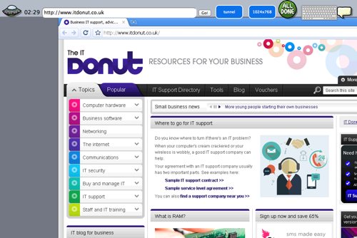
First up is Browsershots. Enter your website address on the homepage and it will generate screenshots showing your site in an enormous range of browsers. It’s a good way to get a quick snapshot of any major problems, although it won’t help you test out functionality.
You can also try Browserling. This enables you to interact with your website within the browser type and version you choose. As a result, you can see how your site functions as well as how it looks.
The bad news? The range of browsers available with Browserling is restricted unless you pay. But it’s still a great way to gain confidence that your site works on other platforms.
TSB shows how not to launch a website
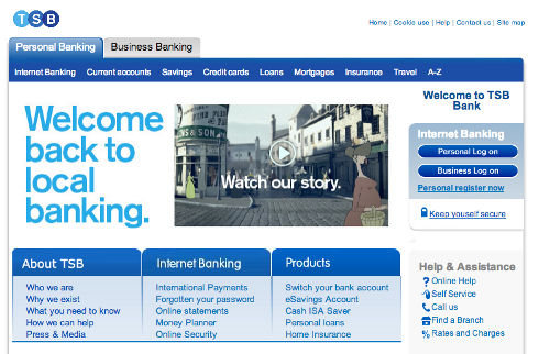
Old skool: the new TSB website
Ta-da! When you've finished putting the finishing touches to your new website, you want the world to know about it.
That often means emailing your customers, shouting about it on Twitter, posting to Facebook and maybe even paying for some ads on Google.
The tale of the new TSB
However, if you're about to set a new site free, you might want to take note of what happened to the relaunched TSB bank earlier this week.
The new bank is being spun off from Lloyds. But when it launched on Monday, its new website promptly hit problems.
Many customers reported they couldn't access the site at all. As a result, the news story that generated most attention was about the website problems, rather than about the bank's launch.
A design from 1999 ... or earlier?
But perhaps worse than launch-day hiccups is the fact that the new bank's website has a decidedly old feel to it. I mean, look at it. Could it be any more 1999?
It's not that an old design is a bad thing in itself, if it works. But surely an organisation billing itself as 'Britain's newest bank' should at least have a vaguely fresh website.
As you might expect, it's come in for a slating on Twitter:
- Well, I think it's lovely that as TSB de-merges from Lloyds after 18 years, they've finally implemented the web site they designed in 1995.
- @brucel - Points at new TSB site: http://t.co/iAOmiCXH3w Starts laughing. Then starts crying. (via @KatherineCory)
- @anna_debenham - So Lloyds TSB are splitting into two separate banks again? Looks like Lloyds got the good designers in the divorce... http://t.co/jrd5CJCvkh
- @BenNunney
We can all learn from this
Getting a new website off the ground is not an easy thing to do
It's almost certainly much harder when you're doing it for a brand that has a history dating back to 1810 and is part of a heavily-regulated industry.
But in this day and age, when a website is such a central part of your customer experience, it's absolutely inexcusable to pass off an outdated design as your main customer-facing website.
In a sector where trust is everything, starting out with a website that looks like it hasn't changed in ten years is not a great way to win people's confidence.
Could Do Not Track hurt your online business?
 Do Not Track is a relatively new initiative designed to make it easier for people to let websites know when they don't want their activities to be tracked.
From the perspective of companies trying to do business online, tracking internet users is important. It allows them to see how people use websites and target advertising more accurately.
Yet privacy advocates argue it's currently difficult for people to control and understand what data websites collect about their internet use.
The EU cookie mess
It was this situation that led to the EU cookie law, which came into full effect about a year ago. The result? A proliferation of confusing pop-up messages about cookies that don't really change anything. Well played, EU cookie law people.
Can Do Not Track make things clearer? It aims to put power in the hands of internet users via a new setting in their web browser. If you don't want websites to track what you do, you can just turn Do Not Track on.
IT dealsSee the latest business tech bargains we've found online. Or buy IT equipment now from these trusted suppliers: |
Do Not Track doesn't work, yet...
Fine in theory. The thing is, Do Not Track is entirely voluntary, so it only works on websites that have agreed to take notice of Do Not Track requests. Currently, the list is pretty small.
But if your business relies on tracking internet users, keep an eye on Do Not Track over the next few months.
Momentum behid the technology might be growing. Microsoft Internet Explorer now comes with Do Not Track switched on as standard. Firefox will be the same from later in the year.
If political pressure or legislation forces more companies to take notice of Do Not Track requests, then it could start becoming harder to track what users do online.
And while many will argue it's about time people had better control over their internet privacy, this could have a significant impact on the online economy.
What was all the EU cookie fuss about?
So... remember the EU cookie law? This time last year it was big news, as companies large and small scrambled to understand the implications and avoid potential fines of up to £500,000.
Cookies are small bits of data used to identify visitors and provide them with a better experience on a website - for instance by keeping them logged in or tracking the pages they visit. Virtually every web page uses them.
The EU cookie law aimed to protect people by making them more aware of what cookies are being set as they use the internet.
Opt-ins cost time and money
Technical and legal experts alike agreed that the law required websites to seek consent from visitors before setting any cookies on their computers. Companies spent time and money getting ready for the law, many implementing pop-ups and overlays which users have found irritating and annoying.
However, it turns out there are two key problems with this approach:
- When people arrive on a website, they want to find information, not worry about cookies. This means many visitors ignore the message altogether, thus failing to opt-in.
- As a result, website owners can't see accurate visitor statistics (because analytics tools rely on cookies), and visitors miss out on functions that use cookies.
It's an unsatisfactory experience for both parties.
The end of cookie opt-ins
Now, it seems like all that effort to create opt-ins might have been unnecessary. Because at the end of last month, the Information Commissioner's Office (that's the body with the job of enforcing the law in the UK) announced it was going to remove the opt-in from its website and start setting cookies as soon as soon as visitors arrived. In addition, the site:
- Has a banner at the bottom of the page to let visitors know cookies are being used.
- Has a page listing cookies in use and a button to delete non-essential cookies.
If that's good enough for the ICO, then surely it must be good enough for the rest of us. And with little evidence to suggest that a lack of an opt-in damages visitor confidence or trust, the obvious move now is for businesses that have implemented an opt-in to remove it.
What's your reaction?
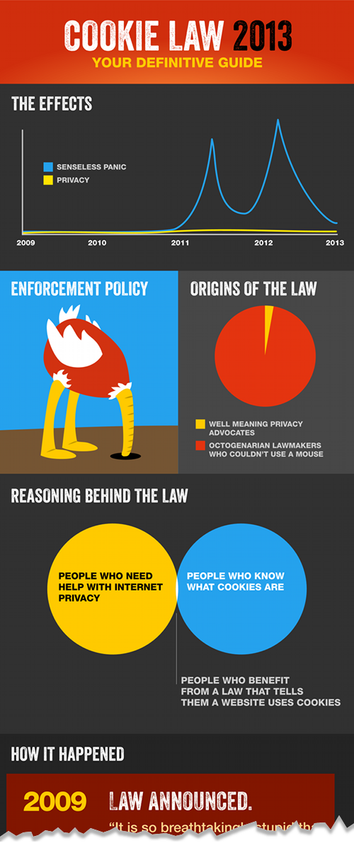
We could offer our own comment on this change in approach, but instead let's turn to Silktide, a software company that's created this great infographic summarising the cookie law so far. Click the infographic to see the full version:
See the full infographic >>
How have you interpreted the cookie law on your website? Will you remove your opt-in message too?
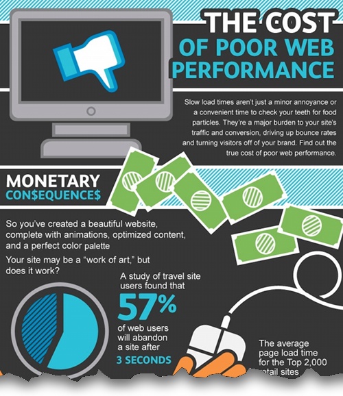
Infographic: the cost of poor website performance
When your website takes more than a few seconds to load, it's obviously annoying for your visitors. But did you know that poor website performance can have a more tangible cost too?
People abandon websites that take too long to load. As your page load time increases, your conversion rate drops. And that means you're making fewer online sales.
To learn more, check out this infographic from SmartBear, a company that offers web development, testing and monitoring services. Click the image to see the full infographic:
Why websites load slowly, and why it matters
How long does your website take to load? Two seconds? Ten seconds? 30 seconds or more? If you've never paid attention to your site's load speed, perhaps you should. It can affect how often people return and influence your rankings on Google.
In short, web page loading times matter. But a whole variety of factors influence how long your homepage actually takes to appear on a visitor's screen.
This infographic shows you the major causes of slow loading sites. How does your site measure up?
Why CAPTCHAs are bad for your website
If you want to find a way to immediately annoy potential customers and drive visitors away from your website, look no further than the humble CAPTCHA.
We've written about these squint-worthy, hard-to-interpret messed-up bits of text before, but today I stumbled upon one that goes beyond a joke.
It popped up this morning on the Ticketmaster website. I had a fair stab at the image on the right side, but I still have no idea what's going on with the left image. Any ideas at all?
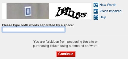
I'm convinced the days of the CAPTCHA are numbered. They're designed to guard against targeted hacking attempts and automated 'bots' that fill in online forms automatically.
But really, unless you're running some sort of super high security website, they cause far more problems than they solve.
When you've taken time to create a nice clear website that makes it really easy for people to buy from you or send you a message, then making them fill in a CAPTCHA is like asking them to complete a fiendish puzzle before they can go any further.
Imagine what would happen if the local corner shop asked you to solve a Rubik's Cube before letting you buy a pint of milk. Wouldn't get much custom, would they?
When you use CAPTCHAs on your website, you risk having the same effect.
TOTW: three free services to monitor for website problems
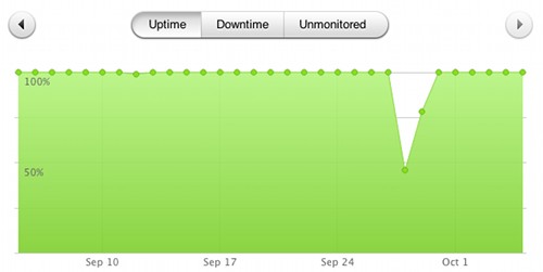
Pingdom can show your website uptime in a graph.
This time last week, I had a bit of a problem. My web hosting company suffered a hardware failure, and my web copywriting website went offline. So did my email, which meant my number one communications channel was severed.
It wasn't a total disaster. My web hosting company was on the case and had everything back up-and-running again within a few hours. They also managed to queue up all the email that came in during that time, so I didn't miss any messages altogether.
Because I was out and about when the problems first occurred, it took me a little while to realise anything was amiss. I use a service which sends me an email should my website fail. But because the problem took out my email too, I never received the message. Whoops.
Since then, I've been looking into tools that will regularly check a website's availability and report any problems. So, for this Friday's tip of the week, here are three that are particularly useful. You can set each up in about five minutes, so if your website is currently unmonitored, it's an excellent way to spend your Friday afternoon:
- Site 24x7 is a service from online app company Zoho. The free version will check your website's availability every hour, and send you an email if it detects problems, like an unusually slow response, or no response at all. You can pay for SMS alerts and more advanced features.
- Pingdom arguably has a nicer interface than Site 24x7 but does the same basic job. If you sign up for the free service, you'll get 20 text message credits included which can be used to send alerts. Once they're used up, you can buy more. There's also a free iPhone app that makes it easy to check alerts and site performance on the move.
- As UptimeRobot says, it 'monitors your website every five minutes, totally free.' This is a good option if you have more than one site, because you can add up to 50 different URLs. It can send alerts by email, Twitter or SMS, although the site does warn that SMS alerts feature 'is not very stable'.
The fastest way to receive a warning of downtime is usually by text message. Most monitoring services charge for this, but you can escape fee-free by setting your monitoring service up to send a direct message to your Twitter account.
As long as your Twitter account has text notifications turned on for direct messages, Twitter will send you a text every time you receive a direct message. So you'll quickly know if there's a problem.
Has a website outage ever gone unnoticed for you? How did you cope?
Should you move to a data centre?
 Your business needs to maintain a reliable backup of digital data, like your customer database, documents, images, emails, accounts and so on.
That data is mission critical, so it all has to be kept safe from theft, fire, flood or accidental deletion. If you run a smaller company, it’s likely your data is stored on a simple server in the office.
What happens as your business grows?
As demand grows for your company’s products or services, you’ll collect more data. As a result, you inevitably end up needing more than a single server. Eventually, you end up with a whole room of the things. This brings new demands and costs:
- You need air conditioning, because lots of servers create lots of heat. If you don’t keep them cool they can fail catastrophically. Providing cooling using traditional air-conditioning units can be very expensive.
- You need an IT professional to make sure your servers keep running reliably. For 24/7 cover you’ll probably need more than one person.
These requirements can become a major financial, logistical and security headache.
Moving to a data centre
A common solution to these problems is to use a purpose-built data centre. Maintained by network specialists, mechanical experts and electrical engineers, a data centre is a secure, computer-friendly environment run at the perfect temperature for the servers inside.
From a security perspective, data centres are also equipped with their own backup power supply. This is usually an uninterruptable power supply (UPS), a large bank of batteries plus a generator to ensure power is always available.
Data centres also usually have direct connections into major internet links – also called the ‘internet backbone’ – meaning connectivity is fast and reliable.
Businesses usually put their servers into a data centre that’s shared with other organisations. This is known as colocation.
What does a data centre look like?
The image above is of a typical data centre. They have lots of aisles between servers stacked in locked cabinets (called racks). You rent as many racks as you want and you pay according to the amount of processing power, storage space or bandwidth you use.
Many providers off both DIY and full service maintenance options, so you can maintain systems yourself or use the provider’s technical support.
There are a number of good arguments for using a data centre:
- Data can be backed up easily and securely
- The risk of data loss is significantly reduced
- Internet access is fast and reliable
- The data centre provides support round-the-clock
- Your overheads are reduced
Using a data centre also makes it easy to add extra capacity as your business grows (you just rent more space) and you don’t have to worry about having lots of servers on your premises.
- Is IT the fifth utility?
- Can the cloud make you more efficient?
- Six signs your business needs a server
David Barker is technical director and founder of 4D Data Centres, the green colocation and connectivity supplier.
How the cookie law affects email marketing
 The much-maligned new EU cookie law isn’t just about cookies. Actually, the text of the regulation doesn’t even mention cookies by name. Instead, its focus is on making people more aware of how their information is used online, and helping people control their privacy.
Essentially it means people now have to actively opt-in before their information is used or their behaviour is tracked in many ways.
The new regulation also applies to other technologies that involve you placing and accessing information on someone’s computer. For instance, the new rules apply to the tiny ‘web beacons’ (actually small image files) used to track when a marketing email is opened.
Some criticism has been levelled at the Information Commissioner’s Office (ICO) for not issuing clear guidance. But actually, to understand what’s expected of companies, we need to step back from the nuts and bolts and look at what the law is trying to achieve.
One that front, the ICO’s message has been consistent: businesses need to be open and transparent, because the law is intended to protect privacy and promote openness.
The new law and email marketing
Plenty has already been said about how the new law affects website cookies. (Read the IT Donut guide, if you need help). So I’m going to look at what happens if your business sends marketing messages by email.
If your company falls into that category, you probably track how people interact with your messages. Crucially, you probably have a tool that lets you see how many people open the emails you send.
Just as with cookies, you need to ask a key question about this ‘open tracking’: what’s its purpose? Just as all cookies aren’t equal, neither is all open tracking.
If you’re using open tracking to report an overall open rate for your entire email campaign, I don’t see how this can come under the new law. It’s just a broad way of tracking how people are interacting with your emails.
Would your email subscribers be surprised to know that you work to get emails delivered and monitor success by checking if the emails are read? I think not. And that’s why I think tracking mechanisms used in this way would fall outside the law.
The law applies when the data gets personal
But here’s a different theoretical case. Say a travel company spots that someone opens emails related to family holidays, then sells that information to a company which then targets them with adverts for child investment products.
This sort of open tracking would certainly fall within the regulations as it clearly involves the privacy of the individual. (I’m just using this example to make the point clear - I don’t actually think anyone does anything even close to this with open tracking!)
Getting new subscribers to opt-in
Having said that, the new law is about openness and transparency. So to be safe, it’s a good idea to keep your email subscribers informed about the tracking you use.
It should be relatively easy to ask new subscribers to opt-in to tracking and cookies. You have to get permission to send them emails anyway, so when you do so just add information about the tracking too.
Remember: openness and transparency are key. So don’t bury the information deep in a policy privacy policy or write it using confusing language. Make it clear and obvious, and reinforce it in your welcome email. For example:
We work hard to avoid cluttering up your inbox by using technology to understand what we should send you. Read how here.
Then, no matter whether you think open tracking is or isn’t covered by the regulations, you’ll know you’re covered. And your customers will be better informed too.
Making sure current subscribers know the score
With new subscribers taken care of, think about what to do your current subscriber base. You need to ask two questions: how do you use open tracking and what would your subscribers reasonably expect you to be doing?
Again, it’s about openness and transparency. You can make current subscribers aware of your use of tracking. Add information about it to your email header. Use the same language you use for new subscribers and keep the information there until it’s reasonable to assume everyone’s seen it. Then you can move it to your email footer.
Don’t panic about your open tracking
In any case, if you have worked to promote openness and transparency you will be in a much better position with the ICO than if you have simply ignored this issue. In short:
- Tell new email subscribers what tracking technology you used. Explain it in simple, clear language that can be easily understood.
- Make sure you include this information if you have a soft opt-in – like when you sign people up as part of a purchasing process on your website.
- Change your privacy policy so people who opt in to emails are also opting in to your open tracking and cookie-based tracking.
- Provide a clear link to your full privacy policy as part of the sign up process, and add a summary to any welcome emails you send out.
- Tell your current subscribers about tracking through an email header. You can move this to the footer once it’s reasonable to think most people will have seen it.
Finally, don’t panic. While the ICO can impose fines of up to £500k, they’re only likely to do so in exceptional circumstances. It needs to be a serious, deliberate contravention of the law that causes substantial damage or distress. Quite simply, I find it hard to envisage a situation where email open tracking could do that.
- Download our guide to the EU cookie law (PDF link)
- Changing how the cookie crumbles – are you compliant?
- Read Rory MccGwire's blog in the Law Society Gazette
Tim Watson is an independent email marketing consultant who writes for Smart Insights.
Why the website X Factor effect is killing small businesses

Avoid the X Factor effect with your website. (Image: Loren Javier on Flickr.)
Creating a website could be the worst thing you do for your business.
In an age where it seems any business without a website is destined for the rubbish heap, the title of this article seems somewhat ridiculous. But it isn't.
Don't get it totally wrong
In 2010 there were 48,000 new start ups, and its assumed at least 50% of these will have a website built. Job done ... or is it?
Many firms get it totally wrong when it comes to their website, not realising that just having one isn't enough. What's the point if your site is never going to be found, or if it puts people off because it has a day-glo green and pink design, with pixelated product photos?
While the old adage 'never judge a book by its cover' sounds great, the truth is people do. Many new businesses lack the funds to have a great-looking website designed, never mind promote it so people can actually find it. For those companies, there isn't a choice. It's straight to Google:
"How to build my own website"
After three weeks of painstaking effort and late nights, their masterpiece is complete and looks 'great'. Well, actually it might or might not look great, but it will almost certainly look like a cheap or free website.
What does that say about your business?
If people do judge books by their covers (and remember, they do!), then what does free or cheap say about your business?
It certainly doesn't say 'here's a well organised company that I feel comfortable dealing with'.
Does it encourage people to move a step forward to purchase from you, or do they go back to Google and find your competitor's warm, snug website they feel they can trust? Probably, it's the latter - so you've alienated a potential customer.
And don’t think it will all be OK later when you've sorted your site out. Your competitor already has a relationship with that customer. To them, you're just the cheap company with the awful website.
Do it properly
So to use another adage: if you're going to do a job, do it properly or not at all.
Sure, self-built websites can really work for you, but you have to decide if you have the ability to really make a professional looking website.
Whatever happens, you want to avoid the X Factor syndrome. By this, I mean if your family and friends say: "wow! what a great website, it looks brilliant," don't go out on stage and show the world unless you're really sure it is. If you get it wrong, you can't simply disappear once you hear the boos. You're stuffed.
On the other hand, there are plenty of companies that offer lower cost sites. Just remember that it's not just about the website. You'll need promotion (like search engine optimisation) and that usually means an ongoing payment.
Do not make the mistake of paying for a website and assuming that's enough, because in most cases, it isn't. You will need to pay for it to be promoted.
Five myths of managing a business website

Does it feel like your website is costing too much? (Image: wwarby on Flickr.)
This is a guest post written by Jonathan Brealey, co-founder of web hosting and reseller hosting company Heart Internet.
Web design terms such as FTP, bandwidth, bounce rate and UX design can soon leave business owners dizzy. It is tempting to see your website as a mixture of technical wizardry and magic that you don’t understand, and perhaps don’t want to.
The truth is, running a website does not have to be difficult or expensive. Here are some of the most common myths surrounding the management of business websites, and why they don’t hold water.
Myth one: a business website has to cost thousands of pounds
Granted, the price of your new website will depend on how big it is and how much development work is required. But generally speaking, you shouldn't be paying the earth for small business websites.
If your website is simply a handful of static pages, with some information about who you are, what you do and where you're based, even if you are paying for a bespoke design, the final price should be in the hundreds and not the thousands of pounds.
Myth two: I’ve got more important things to do than manage my website
No matter which industry you are in, a large proportion of your potential customers will go online to research their new supplier. That means their first impressions will be based on how your website looks, how easy it is to navigate, and what it says (or doesn’t say).
Whether you sell the majority of your products face-to-face, or you only deal with business-to-business services, your website is your shop window. It must be used to entice people in.
Myth three: you need to update content regularly
The idea you have to create new and fresh content on an almost daily basis has sprung up thanks mainly to the misconceived idea that Google rewards regularly updated websites.
Actually, Google likes good quality content that attracts links and uses keywords relevant to a user’s search. There are countless examples of websites that are top of the search results that rarely, if ever, change their website’s content (our very own Heart Internet website being a good example).
Myth four: good software costs money
Most leading web software won’t cost you a penny. The great thing is that the free options are often the most popular options not because they are free, but because they are often the best solutions.
For example, you can use WordPress for your blog, OpenCart for your online shop, phpBB for your forum and osTicket for your online support.
Even when the software available isn’t the market leader, the free options are usually more than up to the task and will be more than good enough for you. For example, use GIMP or Paint.NET instead of Photoshop and NotePad++ or Aptana Studio instead of Dreamweaver.
Myth five: You should pay someone to install Google Analytics on your website
If any web designer or agency wants to charge you for installing Google Analytics on to your website, look elsewhere because you can’t trust them.
Google Analytics is free software and the installation should be included in the web design work at no extra cost. If they intend to invoice you for the work as a separate cost they are trying to trade on your lack of knowledge in this area. Adding the tracking code to a web page is at most a 15 second job, and that is if they do it slowly.
What's web analytics all about?
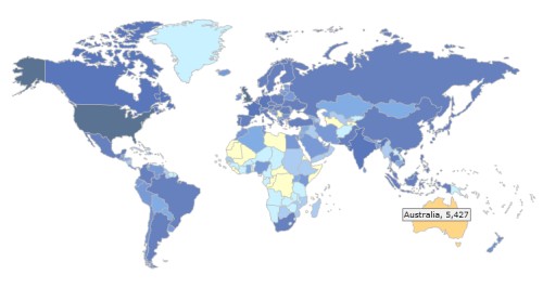
See where in the world your website visitors come from
Disclaimer: Noah Merritt is a co-founder of Clicky Web Analytics.
When it comes to websites, many small business owners think that 'if you build it, they will come'. But how can you know for sure? You need a return communication or feedback mechanism.
The best option is a web analytics system. It can gather and organise data about visitors to your website, so you can start learning about them. Then you'll begin to understand where people are coming from, how they interact with your website, and - to an extent - who those visitors are.
The wrong measurements
The word 'hits' is often used to describe website traffic. But we need to stop using it. It's an ambiguous label that originated in the early '90s, when almost every website had a 'hit counter'.
A hit literally meant any request a client made to a web server. Maybe that was useful 15 years ago, but today, a single web page can produce hundreds of hits (there's a separate hit for every individual image, and for other elements).
So 'hits' has no clear definition, is based on a useless measurement, and doesn't allow for any deep understanding.
Some archaic analysers come as standard with web hosting. These are the original traffic analysis tools which produce raw, basic data. They often don't even differentiate between real people visiting your website and the 'robots' from search engines which scan your site. It's confusing and misleading. Don't bother.
What should you measure?
Use a decent web analytics package instead. There are lots of different things you can measure on your website. I'll cover the most important here - there's a long list of them on the Clicky website:
- Visitors. A visitor is generally calculated from the time a computer accesses your site until when they leave. If that same visitor then returns, they'll be recorded again in the total visits figure.
- Unique visitors. This is exactly the same as visitors, except it filters out repeat visits by the same person.
- Page views and actions. A page view is the metric used to track when a single page of your website loads. But actions measure things that happen within a page - like playing a video, liking a post on Facebook or placing a bid on eBay.
- Referrers. One of the main ways websites receive visitors is from sites that link to them. These sites are called referrers, and referrer data can tell you which websites are most valuable for sending you traffic.
- Searches. Search engines like Google will send you lots of traffic too, and you can see which keywords people are using to find your website.
- Geography. Knowing where in the world your visitors are coming from can be eye-opening. Maybe you're getting a traffic surge from a new part of the world - well, with the right web analytics you can determine why it's happening, or even open a chat session with visitors from particular places.
- Goals. Many website owners want to know when visitors complete a specific action. For instance, you can set up your web analytics package to register when someone makes a purchase from your online shop, and to record how much the purchase was worth.
- Campaigns. If you're running online advertising, campaign tracking will show you what happens to the visitors you receive from each different advert. And that lets you see which ads are sending you most new customers.
- Advanced filtering. Also called segmentation, this lets you split your visitors into groups. You can filter by visitor location, whether they're using a mobile phone, how they found your site ... almost anything you can think of.
- Social media. If people are talking about your business on social media, don't you want to know what they're saying? Some tools can monitor conversations on social networks like Twitter, and compile statistics about what people are saying.
Don't worry if you haven't taken in everything I've covered here. Web analytics can seem overwhelming at first. The best thing you can do is to get your website set up with some sort of web analytics (obviously I'd recommend Clicky), then start checking your numbers daily.
You'll soon get the hang of how to view, analyse and drill deep into your data in order to improve your website and its traffic levels.
Mobile website or mobile app: what's the difference?
How does your company website look on a mobile phone? With more and more people using the internet on the move, it's important to cater for people who are on mobile phones. If you don't you could be annoying visitors to your site or even missing out on sales.
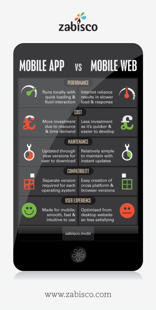
But there are two main ways to cater for mobile users. You can create a version of your website that's designed for the small screens of mobile handsets. Or you can build a mobile app - a small program that people can download and use on their phone.
To help you understand the difference between the two, we've created this infographic.
(See it full size in a new window.)
Has your business started thinking about how mobile users can access your website? Leave a comment and let us know what you decided to do.
Laura Hampton works for Zabisco. Read the Zabisco blog.
Optimising your business website for mobile phones
This is a guest post written by Jonathan Brealey, co-founder of web hosting and reseller hosting company Heart Internet.
An ever-increasing proportion of your website's visitors are coming from mobile phones. For example, in September 2009, just 0.02% of all UK web traffic originated from a mobile device. In January 2011 this figure was a staggering 8.09%, representing a growth of over 4000% (source: www.tecmark.co.uk). With the growing popularity of the iPhone and Android powered phones, this trend is only going to continue.
While you can continue to show your normal website to mobile visitors, you could proactively increase sales and revenue by optimising your website for mobile web browsers.
For example, most websites are built with a full-screen monitor in mind, often with a resolution of 1024 x 768 pixels or above. However, an iPhone's screen size is much smaller, at 320 x 480 pixels.
Mobile internet users don’t want to navigate a web page full of text, images or videos to find the information they need. Although your existing website is aimed at giving a full and comprehensive picture of your business, a mobile site should deliver immediate access to what matters most when on the go.
Top tips designing your website for mobile phones
- Use mobile website building software such as goMobi for quick set up plus automatic device detection.
- Alternatively, if you want to build it yourself, put the mobile version on a sub-domain (e.g. mobile.websitename.com) and send mobile traffic to that version of the site.
- Your visitors don’t want to scan pages full of information. They want to be presented with what they need as quickly and efficiently as possible. Identify the key content on your site and make that the most prominent on your mobile website.
- A lot of visitors will be accessing websites via a 3G connection, which tends to be slower than the broadband you have at home. With this in mind, keep images to a minimum so pages load quickly.
- Rethink your navigation. Pressing a normal blue text link can be tricky on a phone. Make navigation buttons and links large enough for fingers to press and don’t have too many on one page.
- Limit scrolling to one direction. You can do this by using a single column layout, reducing the amount of scrolling and pinching the user has to do.
- Don’t rely on Flash for any of your content. It will be fine on most devices, but it won't work on the iPhone. As the iPhone is the biggest selling smartphone, lots of your visitors are likely to be using one.
Some good mobile websites
A good way to start is to look at what people have been done before. It can give you an idea of what works and - importantly - what you can improve upon.
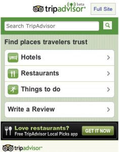
Here are some examples of leading businesses with mobile phone optimised versions of their websites:
What are your favourite mobile websites? And what plans do you have for yours? Leave a comment to let us know.
Olympic errors: why you should take testing seriously

Launching a new website can be stressful. Just ask the organisers of the London Olympics, who opened their ticket website last week. After last Monday's big switch on, it didn't take long for people to twig that the site couldn't handle debit and credit cards due to expire before August. Whoops.
Interestingly, reports say that 'the website and ticketing guide clearly state that Visa cards must expire no earlier than August 2011'. In other words, the expiry date restrictions were known about when the site launched, but people weren't reading the explanation before putting in their ticket applications.
It's a common problem: people don't bother reading instructions, then get frustrated when things don't work as they expect. In short: if you have to explain your website, it's too complicated.
Always test thoroughly
Before you launch a new website - or any IT system - it's really important you test it thoroughly. You need to catch all the bugs you can and ensure everything is secure.
But that's not enough. Your site must be easy to use too. Can people find what they're looking for? Is your order process straightforward?
It might be harder to answer these questions definitively (not everyone's perception of 'easy to use' is the same), but it's vital you do your best.
If you're working with a software developer or web design company, they'll be able to help you with all kinds of testing. And there's plenty of information about usability testing on the Marketing Donut, our sister site.
But whatever you do, put time and consideration into how you test any new IT system . It could make the difference between success and failure. Or - as the Olympics organisers have illustrated so well - it could help you avoid any unnecessary bad publicity.
(Image of a ticket booth from Flickr user Sister72 under a Creative Commons Attribution licence.)

