What we can all learn from Microsoft's new homepage
What we can all learn from Microsoft's new homepage
Over the years Microsoft's homepage has had many different designs. The software giant unveiled another recently, and it applies responsive web design, a relatively new technique that could be on the cusp of going mainstream.
A responsive website is one that automatically tailors its design and layout to fit whatever size screen it's being viewed on. Responsive web design came about because modern websites have to cater for people using a huge variety of screen sizes, from tiny phones to monster widescreen displays.
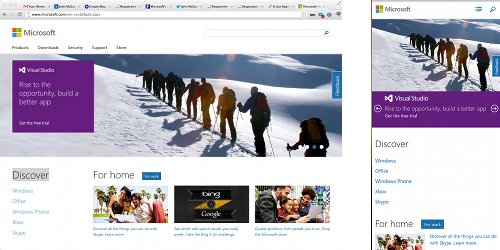
The best way to see what this means in practice is to visit Microsoft's homepage and watch how the layout changes as you resize your web browser window.
On the left is Microsoft's homepage in a full-screen window. On the right, how it looks on a narrower display:

Responsive web design has been championed by cutting edge web designers since 2010, but so far it's not been adopted by many big websites. This move by Microsoft could mark a turning point for the technique. Don't be surprised to see other big-name sites go the same way in the next six months.
Advocates of responsive web design say that as screen sizes continue to diversify, it's the only sensible way forward. Sure, you can create a mobile website that works fine on a small screen, but what about mobile phones with larger screens? What about tablet computers, which can have anything from a 6" screen to a 12" screen?
There's a message here for your business, particularly if you're looking to redesign your website. It's really important to think about how to cater for different devices (read why it matters here), and a responsive approach is a great way to do this.
It gives you more flexibility than creating a separate mobile website, because it will work on screens of all sizes. What's more, you don't have to worry about maintaining two different sites.
To learn more about responsive web design, there's a good introduction here. To see some real-world examples of responsive sites, check out Media Queries.


Comments
Add a comment