Blog posts tagged web design
Google now warns when mobile sites aren't smart
Figures released recently suggest that 30% of internet use in the UK now takes place on mobile devices.
The proportion of mobile users will vary from site to site, of course (about 12% of IT Donut traffic comes from smart phones and tablets), but it underlines the fact that it's really important your website works on mobile devices
Having a site that 'works' on mobiles can mean a range of things.
You might have a slick responsive website that adapts itself to any screen size. You could have a separate mobile version of your site. Or perhaps you haven't made any changes, because your standard desktop website functions ok on smaller screens.
Are you using smart redirects?
If you have a completely separate mobile website, you need to create a system that detects when a visitor is using a mobile device, then sends them to the mobile site.
With this approach, it's important the redirect is smart. For instance, if a visitor has arrived at your website after searching Google for 'six person tent', you should show them the mobile page about six person tents.
Google's warning
Some websites simply send all mobile visitors to the mobile homepage. This is a poor experience for visitors, because it forces them to navigate manually to the content they're looking for.
(This classic XKCD comic sums up the problem perfectly.)
If your website behaves this way, it could start to significantly affect your visitor numbers. That's because Google has begun to detect and flag these unhelpful, faulty redirects.
If you search for something on your smart phone and a site in the results has such a redirect, you'll see a warning message like this:
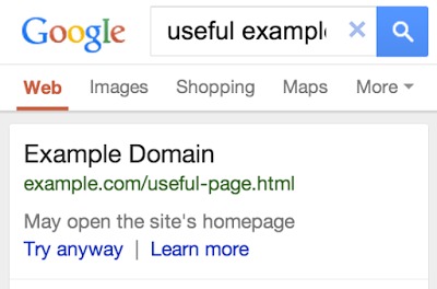
It's a slightly clunky fix to a clunky problem, but you can bet that message is going to put people off viewing your website.
In time, don't be surprised if Google starts demoting sites that don't bother with smart redirects. You have been warned!
Look at how far web design has come
By the standards of traditional industries, web design is incredibly young. Yet in the 20-ish years it’s been possible to make a living from building websites, the approaches and techniques involved have changed remarkably.
You only have to browse back through the Internet Archive to see the differences between then and now. Just check out Microsoft in 1996, Ford in 2000 or British Airways in 1999.
Web design agency Aptitude has taken a look back over the history of web design in this interesting infographic:
(Incidentally, we don’t think it’s accurate to say mobile internet access exceeded desktop access as early as 2008. It probably hasn’t happened yet — but we’ll let that slide.)
49 of the UK's top 50 retailers don't have responsive websites

Responsive websites adapt to fit different screens.
According to IDC's worldwide and US tablet forecast, 2013 will be the first year in which more tablet computers are sold than traditional PCs. But although consumers are increasingly using smaller screens to view websites and buy online, online retailers are lagging behind with their websites.
Digital solutions provider Venda analysed websites from the top 50 e-retailers as defined by IMRG and Experian (admittedly, this list is a couple of years old).
The results are quite striking. It found that only one of these retailers uses responsive web design to create a site that automatically adapts itself to different screen sizes. The retailer in question is Currys.
Make mobile shopping easier
Given that a third of all UK page views now come from smart phones and tablets, delivering a good user experience across all devices should be top priority for anyone looking to sell online.
Responsive web design isn't the only way to do that. Many businesses run a completely separate mobile website, designed specifically for small smart phone screens. Some also have mobile apps to help you search and buy items quickly.
Both these approaches are fine, but neither makes good use of screen sizes that fall in between smart phones and desktop computers. The great thing about responsive sites is that they're fluid, and designed to work on any screen, rather than those of specific sizes.
The argument for going responsive
If you've not given much thought to the experience mobile users have on your business website, now really is the time to start. You'll find that the argument in favour of a responsive approach is strong.
Responsive design is the best way to create a consistent user experience, no matter what device people are viewing your website on. The content on the pages remains fundamentally the same, but just displays differently.
This means that you don't have to find a way of identifying mobile users in order to show them a different website, or worry about redirecting URLs so people see relevant information on both versions of your website.
When people share links to your website, you'll also know that the pages will always be optimised for the viewing device, not the device the link was shared from.
Quite simply, responsive web design is the only way to cater for the ever-expanding range of devices that people are using to access the internet. It's time to start making our sites more flexible.
How responsive web design can net you more customers
More and more web traffic is coming via screens which are not attached to a traditional PC. If you want to keep abreast of the competition - and particularly if you depend on real visitors to your premises - you need to embrace mobile and tablet access.
There's a lot of buzz around mobile web access, and rightfully so. More and more potential customers are looking for products and services using their mobile phones.
If your web site is difficult to use on anything other than a standard computer screen then you won't be getting their business.
Local businesses need mobile sites
It matters even more if you operate a local business where you want people to visit your premises.
You might be running a shop, sandwich bar or cafe. But if someone looks up your business on their phone then they are far more likely to be in immediate buying mode than someone searching on a PC from home.
When they reach your website, it's important visitors can identify where your business is located and what you have to offer. If they can't do so quickly, they'll move to the next site on their screen.
Responsive web design
One way of doing this is through responsive web design. It's a technique that's been around since 2010 or so. It involves creating your website so it adapts to fit whatever size screen it appears on.
To show the difference between an old fashioned static site and a modern responsive website which changes depending on the size of screen, take a look at our short video:
In the first section you'll see a mock-up of our website which is completely non-responsive. As soon as the screen gets below a certain width things start to disappear off the side, making it difficult to see what's happening.
The second section of the film shows our live responsive website. As the browser narrows, a stepped change in presentation occurs. Elements are made smaller and stacked to fit on the available screen estate. They still look appealing and can be read easily.
You can see lots of other examples of responsive web design over on the Media Queries website, or visit our website and resize the browser window for yourself.
Making your website responsive
So, is it possible to change your existing site to be responsive? Well, not without some work, is the short answer.
However, adding responsive functions to a website isn't always easy, and it's hard to be confident the site works properly if it wasn't designed to be responsive from the start.
What's more, if your existing website is not responsive, it's likely old enough to be lacking in other areas. Maybe it's difficult to maintain, lacks social media functions or looks old fashioned.
All in all, that may mean it's good time to invest in a new site which is responsive, has a modern lightweight design, is goal driven (so it directs users towards buying or contacting you), includes more social interaction and makes it easy to post updates, blog posts or news articles.
As mobile internet use continues to grow (it's at 15% on my own site and still increasing), now is the time to take advantage of that traffic.
- What we can learn from Microsoft's responsive home page
- Six ways to make your website look great on a smart phone
- How a mobile website could net you more customers
John Norton is owner of No Worry Web, a company that creates and manages small business web sites and social media presence for an all-inclusive monthly fee. Follow him on Twitter: @NoWorryWeb.
What we can all learn from Microsoft's new homepage
Over the years Microsoft's homepage has had many different designs. The software giant unveiled another recently, and it applies responsive web design, a relatively new technique that could be on the cusp of going mainstream.
A responsive website is one that automatically tailors its design and layout to fit whatever size screen it's being viewed on. Responsive web design came about because modern websites have to cater for people using a huge variety of screen sizes, from tiny phones to monster widescreen displays.
The best way to see what this means in practice is to visit Microsoft's homepage and watch how the layout changes as you resize your web browser window.
On the left is Microsoft's homepage in a full-screen window. On the right, how it looks on a narrower display:
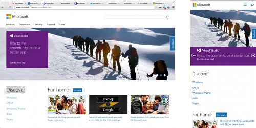
Responsive web design has been championed by cutting edge web designers since 2010, but so far it's not been adopted by many big websites. This move by Microsoft could mark a turning point for the technique. Don't be surprised to see other big-name sites go the same way in the next six months.
Advocates of responsive web design say that as screen sizes continue to diversify, it's the only sensible way forward. Sure, you can create a mobile website that works fine on a small screen, but what about mobile phones with larger screens? What about tablet computers, which can have anything from a 6" screen to a 12" screen?
There's a message here for your business, particularly if you're looking to redesign your website. It's really important to think about how to cater for different devices (read why it matters here), and a responsive approach is a great way to do this.
It gives you more flexibility than creating a separate mobile website, because it will work on screens of all sizes. What's more, you don't have to worry about maintaining two different sites.
To learn more about responsive web design, there's a good introduction here. To see some real-world examples of responsive sites, check out Media Queries.
Website error pages: don't 404get them!
In an ideal world, every page on a website would work and nobody would ever see a website error page. But we don't live in an ideal world and website error pages are very much a part of the online experience – so why not make the most of them?
Website error pages are shown when something goes wrong with your website. Typically, this will be a 'page not found' - a '404 error' - where a link has moved, although it could be that the user has simply mistyped the address. Different types of errors have different codes - common ones include the 403 'forbidden' error or the 500 'server error'.
Errors are regrettable, but certainly not unsalvageable. A well written error page can actually benefit your brand and help instil trust, proving that you take ownership of mistakes and do your best to rectify them.
You can also be creative in the design, using your website error pages as places to show off your fun side or promote your artistic talents.
And it's not only your users who will benefit from a custom error page. Search engines will reach error pages as they explore your site. Again, providing they are well written and well-designed, they can be portals to new content rather than dead ends.
Here are our top tips for creating the ideal error page:
1. Be honest
Honesty is very much the best policy on an error page. Accept that something has gone wrong and explain why it has. That way, users will be more accepting that sometimes things do go wrong and far less likely to leave your site.
This example uses honesty and apology to help lost users. The use of 'I' shows the brand as one which takes responsibility for mistakes:

Smashed eggs from Deliciously Creative.
2. Be helpful
Allowing users to become stranded on your error page will ruin their experience and probably cause them to leave. Give them somewhere to go by offering useful or popular links.
Here, users are given possible solutions to the problem, along with useful links which mean the page is not a dead end:
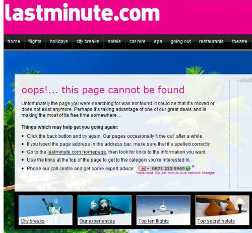
From Lastminute.com.
3. Be yourself
Showing your personality is a good thing. Whether your website represents a corporate brand or a one-person shop, giving your error page an (appropriate) feel will welcome the user and help them feel comfortable staying on your site, despite the error.
This page follows HootSuite's owl-based branding and adds a bit of humour to the situation:

From HootSuite.
4. Be creative
Don’t be afraid to let your creative juices flow! Just because your error page won’t appear often doesn’t mean it shouldn’t look great. Plus, error pages don’t need a lot of content, so you really can go bold with the visuals. Here are some of our favourite creative error pages:
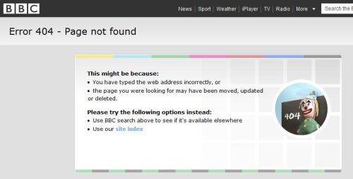
The BBC uses the old-skool testcard to great effect.
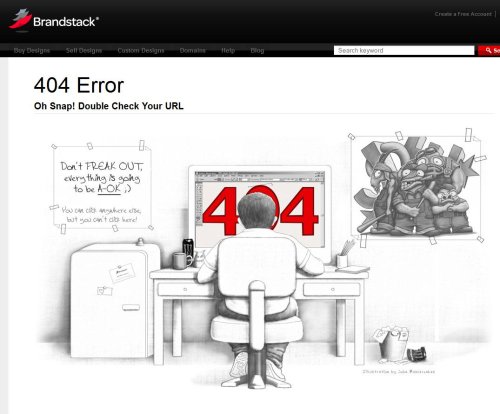
Brandstack have a whimsical pencil drawing.
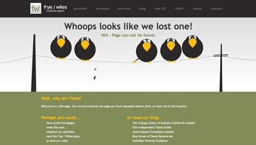
Frye / Wiles have gone with some birds on a wire.
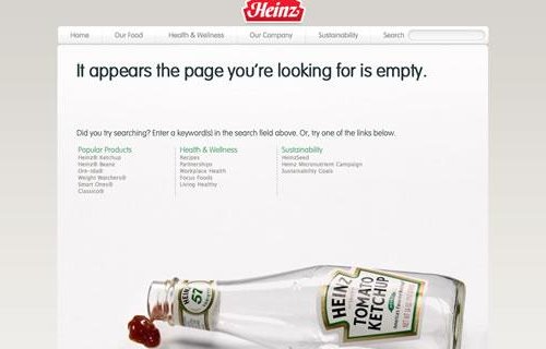
You have to love this great use of the iconic Heinz tomato ketchup bottle.
Laura Hampton works for Zabisco. Read the Zabisco blog.
Five myths of managing a business website

Does it feel like your website is costing too much? (Image: wwarby on Flickr.)
This is a guest post written by Jonathan Brealey, co-founder of web hosting and reseller hosting company Heart Internet.
Web design terms such as FTP, bandwidth, bounce rate and UX design can soon leave business owners dizzy. It is tempting to see your website as a mixture of technical wizardry and magic that you don’t understand, and perhaps don’t want to.
The truth is, running a website does not have to be difficult or expensive. Here are some of the most common myths surrounding the management of business websites, and why they don’t hold water.
Myth one: a business website has to cost thousands of pounds
Granted, the price of your new website will depend on how big it is and how much development work is required. But generally speaking, you shouldn't be paying the earth for small business websites.
If your website is simply a handful of static pages, with some information about who you are, what you do and where you're based, even if you are paying for a bespoke design, the final price should be in the hundreds and not the thousands of pounds.
Myth two: I’ve got more important things to do than manage my website
No matter which industry you are in, a large proportion of your potential customers will go online to research their new supplier. That means their first impressions will be based on how your website looks, how easy it is to navigate, and what it says (or doesn’t say).
Whether you sell the majority of your products face-to-face, or you only deal with business-to-business services, your website is your shop window. It must be used to entice people in.
Myth three: you need to update content regularly
The idea you have to create new and fresh content on an almost daily basis has sprung up thanks mainly to the misconceived idea that Google rewards regularly updated websites.
Actually, Google likes good quality content that attracts links and uses keywords relevant to a user’s search. There are countless examples of websites that are top of the search results that rarely, if ever, change their website’s content (our very own Heart Internet website being a good example).
Myth four: good software costs money
Most leading web software won’t cost you a penny. The great thing is that the free options are often the most popular options not because they are free, but because they are often the best solutions.
For example, you can use WordPress for your blog, OpenCart for your online shop, phpBB for your forum and osTicket for your online support.
Even when the software available isn’t the market leader, the free options are usually more than up to the task and will be more than good enough for you. For example, use GIMP or Paint.NET instead of Photoshop and NotePad++ or Aptana Studio instead of Dreamweaver.
Myth five: You should pay someone to install Google Analytics on your website
If any web designer or agency wants to charge you for installing Google Analytics on to your website, look elsewhere because you can’t trust them.
Google Analytics is free software and the installation should be included in the web design work at no extra cost. If they intend to invoice you for the work as a separate cost they are trying to trade on your lack of knowledge in this area. Adding the tracking code to a web page is at most a 15 second job, and that is if they do it slowly.
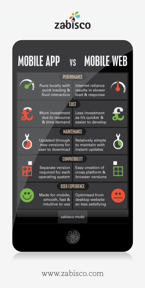
Mobile website or mobile app: what's the difference?
How does your company website look on a mobile phone? With more and more people using the internet on the move, it's important to cater for people who are on mobile phones. If you don't you could be annoying visitors to your site or even missing out on sales.
But there are two main ways to cater for mobile users. You can create a version of your website that's designed for the small screens of mobile handsets. Or you can build a mobile app - a small program that people can download and use on their phone.
To help you understand the difference between the two, we've created this infographic.
(See it full size in a new window.)
Has your business started thinking about how mobile users can access your website? Leave a comment and let us know what you decided to do.
Laura Hampton works for Zabisco. Read the Zabisco blog.
Optimising your business website for mobile phones
This is a guest post written by Jonathan Brealey, co-founder of web hosting and reseller hosting company Heart Internet.
An ever-increasing proportion of your website's visitors are coming from mobile phones. For example, in September 2009, just 0.02% of all UK web traffic originated from a mobile device. In January 2011 this figure was a staggering 8.09%, representing a growth of over 4000% (source: www.tecmark.co.uk). With the growing popularity of the iPhone and Android powered phones, this trend is only going to continue.
While you can continue to show your normal website to mobile visitors, you could proactively increase sales and revenue by optimising your website for mobile web browsers.
For example, most websites are built with a full-screen monitor in mind, often with a resolution of 1024 x 768 pixels or above. However, an iPhone's screen size is much smaller, at 320 x 480 pixels.
Mobile internet users don’t want to navigate a web page full of text, images or videos to find the information they need. Although your existing website is aimed at giving a full and comprehensive picture of your business, a mobile site should deliver immediate access to what matters most when on the go.
Top tips designing your website for mobile phones
- Use mobile website building software such as goMobi for quick set up plus automatic device detection.
- Alternatively, if you want to build it yourself, put the mobile version on a sub-domain (e.g. mobile.websitename.com) and send mobile traffic to that version of the site.
- Your visitors don’t want to scan pages full of information. They want to be presented with what they need as quickly and efficiently as possible. Identify the key content on your site and make that the most prominent on your mobile website.
- A lot of visitors will be accessing websites via a 3G connection, which tends to be slower than the broadband you have at home. With this in mind, keep images to a minimum so pages load quickly.
- Rethink your navigation. Pressing a normal blue text link can be tricky on a phone. Make navigation buttons and links large enough for fingers to press and don’t have too many on one page.
- Limit scrolling to one direction. You can do this by using a single column layout, reducing the amount of scrolling and pinching the user has to do.
- Don’t rely on Flash for any of your content. It will be fine on most devices, but it won't work on the iPhone. As the iPhone is the biggest selling smartphone, lots of your visitors are likely to be using one.
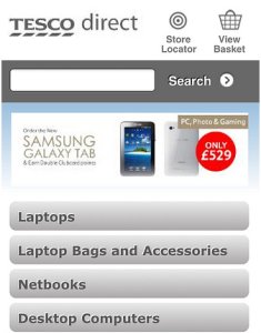
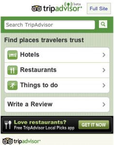
Some good mobile websites
A good way to start is to look at what people have been done before. It can give you an idea of what works and - importantly - what you can improve upon.
Here are some examples of leading businesses with mobile phone optimised versions of their websites:
What are your favourite mobile websites? And what plans do you have for yours? Leave a comment to let us know.
What I learnt about the future of web design
Last week I headed on down to the Future of Web Design conference. Held in an old brewery in the City of London, this annual event brings together web designers and developers from all over the world.
I really enjoyed the conference and it was a great chance to get away from my day-to-day tasks for a bit. Although a lot of what I heard was quite detailed information aimed at professional web developers and designers, I took away a few bits of knowledge that I think nearly any business with an online presence can benefit from. Here they are:
- If you're considering building a mobile app for your business, don't forget about making your website friendly for mobile phones too. In particular, Josh Clark argued that people see mobile apps as tools for getting particular tasks done, whereas the mobile web is all about finding information.
- In fact, a lot of the conference covered mobile-related internet stuff. There were some impressive statistics involving the amount of money people spend when online with their smart phones, and the rate at which accessing the internet via mobile devices is growing. In short: if you're not thinking about mobile devices when you build your website, you're neglecting an ever-increasing group of users.
- Ian Hamilton is a senior interaction designer from the BBC. He gave a talk on accessibility, making me realise how far most websites still have to go in order to be usable by people who have visual, auditory, motor or cognitive disabilities. He suggested including people with disabilities in any usability testing that you run, providing transcripts of all videos on your website, and ensuring all linked text is meaningful ('more information' does not cut it).
- Dan James founded silverorange, a small web agency based in Canada. He spoke about running an open business. In his company, everyone - from the MD down to junior designers - earns the same salary. He says that often in business we talk about a lot of things, but we don't talk about money. He says we should try it. These sketch notes reveal more.
- To design great user experiences, we should try and stay naive. At least, that's one of the things I took from Aral Balkan's talk. In an entertaining 50 minutes, he explained how he tries to not think too hard when he uses things for the first time. Because if something's been designed well, you shouldn't need to stop and work out how to use it. You should just know. Watch a similar talk here.
What do you think the future of web design holds? What new innovations are you planning for your website? Leave a comment and let us know.
Why website usability matters
In the world of web design, usability and user centred design are buzz phrases of the moment. But what do they really mean for your business? And don't you have to have a big web design budget to worry about stuff like that?
What is usability?
Usability on the web is about ensuring everything on your website is as easy to use, read and find as possible.
At the most basic level, that means putting proper calls to action (things you want people to do) on your website, highlighting key areas and making sure everything works properly.
On a more advanced level, usability is achieved by structuring and building your website according to the needs of its users and the behaviours they display during testing and research.

The British Heart Foundation’s website structure is based on the feedback of focus groups and research through user testing. (The BHF is a client of Zabisco.)
Why does usability matter?
In today’s fast-paced world, your users have less time than ever to spend on your website. Why would anyone wait ten seconds for it to load when thousands of alternatives are a click away? Why would they spend time digging for information when other sites make it easier to find?
Users have a low tolerance of poor usability. And why shouldn't they? It's annoying when things are hard to use, and websites are no exception.
It’s vital your website works properly and loads quickly. Your web developers should be able to advise you on the best ways to achieve what you want from your website. Your choice of web hosting service can affect the load speed too.
But it’s not just about load speeds and functionality. Your website’s content and layout are also key elements of the user experience. By understanding the needs and motivations of people who visit your site, you can tailor your content to fit them.
Make your website more usable
At Zabisco, we create top class user experiences. We use customer research, information architecture, user centred design and content and web development to meet the needs of your end user.
But if you don’t have the budget to invest in user experience services from an agency, here’s how to improve your own website - quickly, easily and cheaply:
- Understand your end user. Your end users / customers / clients (or whatever you call them) are the most important people for your business. Understanding them is the first step to improved usability. It can be as simple as asking them. Pick up the phone – or even better, meet them in person.
- Simplify your navigation. Your navigation should direct users to the areas of your site they will find valuable, in ways they can understand. Simplify your labelling and ensure it uses language your end users are familiar with.
- Provide clear calls to action. A call to action is any button or hyperlink that asks your user to do something. Create calls to action which tell your users what you want them to do and help them achieve their goals on your site.
- Think about your layout. Show your users what they need to see – it’s as simple as that! A clear layout helps people navigate your site. It can also reflect your business branding and structure in a really positive way.
- Build your website properly. A top class website build will mean everything on your site works efficiently and intuitively. Think about search engine optimisation when building your website too, to help search engines recognise the purpose of your site and send you traffic that will benefit from your services and content.
Usability is more than a buzz word. Done properly, it will provide real benefit to your users and your business.
Laura Hampton works for Zabisco. Read the Zabisco blog.


