Google now warns when mobile sites aren't smart
Google now warns when mobile sites aren't smart
Figures released recently suggest that 30% of internet use in the UK now takes place on mobile devices.
The proportion of mobile users will vary from site to site, of course (about 12% of IT Donut traffic comes from smart phones and tablets), but it underlines the fact that it's really important your website works on mobile devices
Having a site that 'works' on mobiles can mean a range of things.
You might have a slick responsive website that adapts itself to any screen size. You could have a separate mobile version of your site. Or perhaps you haven't made any changes, because your standard desktop website functions ok on smaller screens.
Are you using smart redirects?
If you have a completely separate mobile website, you need to create a system that detects when a visitor is using a mobile device, then sends them to the mobile site.
With this approach, it's important the redirect is smart. For instance, if a visitor has arrived at your website after searching Google for 'six person tent', you should show them the mobile page about six person tents.
Google's warning
Some websites simply send all mobile visitors to the mobile homepage. This is a poor experience for visitors, because it forces them to navigate manually to the content they're looking for.
(This classic XKCD comic sums up the problem perfectly.)
If your website behaves this way, it could start to significantly affect your visitor numbers. That's because Google has begun to detect and flag these unhelpful, faulty redirects.
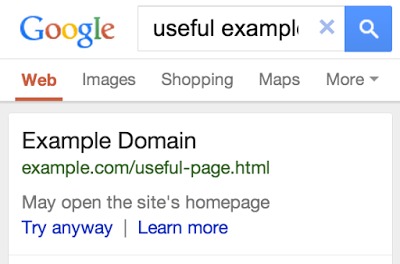
If you search for something on your smart phone and a site in the results has such a redirect, you'll see a warning message like this:

It's a slightly clunky fix to a clunky problem, but you can bet that message is going to put people off viewing your website.
In time, don't be surprised if Google starts demoting sites that don't bother with smart redirects. You have been warned!


Comments
Add a comment