Blog posts tagged error pages
Website error pages: don't 404get them!
In an ideal world, every page on a website would work and nobody would ever see a website error page. But we don't live in an ideal world and website error pages are very much a part of the online experience – so why not make the most of them?
Website error pages are shown when something goes wrong with your website. Typically, this will be a 'page not found' - a '404 error' - where a link has moved, although it could be that the user has simply mistyped the address. Different types of errors have different codes - common ones include the 403 'forbidden' error or the 500 'server error'.
Errors are regrettable, but certainly not unsalvageable. A well written error page can actually benefit your brand and help instil trust, proving that you take ownership of mistakes and do your best to rectify them.
You can also be creative in the design, using your website error pages as places to show off your fun side or promote your artistic talents.
And it's not only your users who will benefit from a custom error page. Search engines will reach error pages as they explore your site. Again, providing they are well written and well-designed, they can be portals to new content rather than dead ends.
Here are our top tips for creating the ideal error page:
1. Be honest
Honesty is very much the best policy on an error page. Accept that something has gone wrong and explain why it has. That way, users will be more accepting that sometimes things do go wrong and far less likely to leave your site.
This example uses honesty and apology to help lost users. The use of 'I' shows the brand as one which takes responsibility for mistakes:
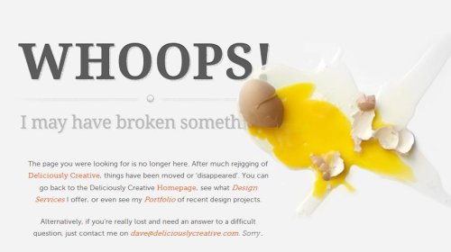
Smashed eggs from Deliciously Creative.
2. Be helpful
Allowing users to become stranded on your error page will ruin their experience and probably cause them to leave. Give them somewhere to go by offering useful or popular links.
Here, users are given possible solutions to the problem, along with useful links which mean the page is not a dead end:
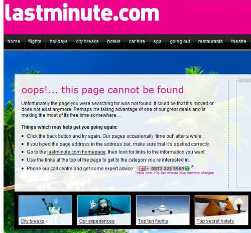
From Lastminute.com.
3. Be yourself
Showing your personality is a good thing. Whether your website represents a corporate brand or a one-person shop, giving your error page an (appropriate) feel will welcome the user and help them feel comfortable staying on your site, despite the error.
This page follows HootSuite's owl-based branding and adds a bit of humour to the situation:
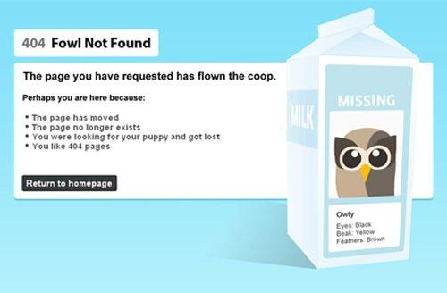
From HootSuite.
4. Be creative
Don’t be afraid to let your creative juices flow! Just because your error page won’t appear often doesn’t mean it shouldn’t look great. Plus, error pages don’t need a lot of content, so you really can go bold with the visuals. Here are some of our favourite creative error pages:
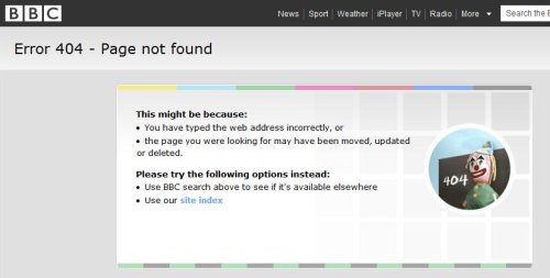
The BBC uses the old-skool testcard to great effect.
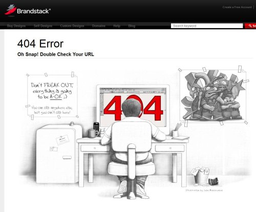
Brandstack have a whimsical pencil drawing.
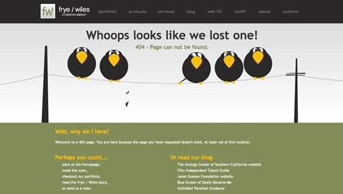
Frye / Wiles have gone with some birds on a wire.
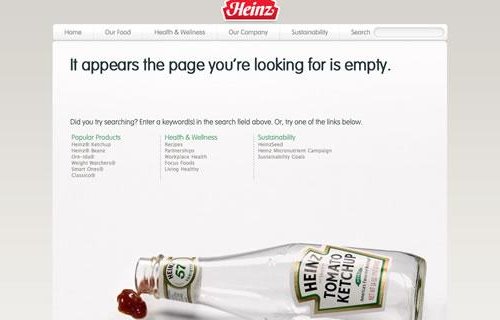
You have to love this great use of the iconic Heinz tomato ketchup bottle.
Laura Hampton works for Zabisco. Read the Zabisco blog.


