Why CAPTCHAs are bad for your website
Why CAPTCHAs are bad for your website
If you want to find a way to immediately annoy potential customers and drive visitors away from your website, look no further than the humble CAPTCHA.
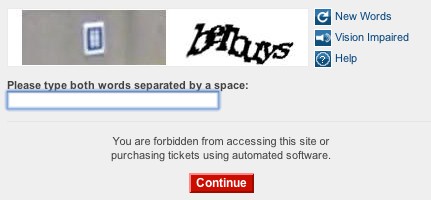
We've written about these squint-worthy, hard-to-interpret messed-up bits of text before, but today I stumbled upon one that goes beyond a joke.
It popped up this morning on the Ticketmaster website. I had a fair stab at the image on the right side, but I still have no idea what's going on with the left image. Any ideas at all?

I'm convinced the days of the CAPTCHA are numbered. They're designed to guard against targeted hacking attempts and automated 'bots' that fill in online forms automatically.
But really, unless you're running some sort of super high security website, they cause far more problems than they solve.
When you've taken time to create a nice clear website that makes it really easy for people to buy from you or send you a message, then making them fill in a CAPTCHA is like asking them to complete a fiendish puzzle before they can go any further.
Imagine what would happen if the local corner shop asked you to solve a Rubik's Cube before letting you buy a pint of milk. Wouldn't get much custom, would they?
When you use CAPTCHAs on your website, you risk having the same effect.


Comments
Ticketmaster has partnered with New York start-up Solve Media to weed out spam bots from the system. Well-known phrases are requested for user input, or the answer to a simple multiple-choice question. But perhaps the most innovative part of the Solve Media system is that unlike Captcha, a sponsor advertisement can be used to facilitate the identification process. The user authentication system can display an ad, then require the human user to repeat back a short advertising slogan. It’s reportedly easier to use than Captcha, and keeps sponsors happy. Read more here
I noticed the same issue with Ticketmaster a few weeks ago. The image on the left-hand side is supposed to be a number on a tile - like the sort you find outside twee holiday homes. What it's doing as part of a CAPTCHA is quite beyond me. It was irritating beyond belief to have to decipher the number and text and enter them repeatedly in my quest for tickets, and it slowed me down too. I don't blame my lack of tickets solely on Ticketmaster but it seems like a daft addition to their site.
Add a comment